

Effective wayfinding signage is essential for any building, facility, or outdoor space to ensure people can easily navigate and find their destinations. Whether it’s a large corporate building, a shopping center, or a hospital, proper wayfinding design not only improves the user experience but also enhances the overall functionality of the space. However, many businesses make common mistakes in designing directional signage that can confuse or frustrate users. Here are the top 5 mistakes to avoid when designing your wayfinding signage.
1. Overcomplicating the Design
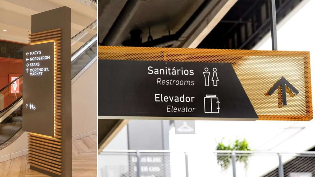
One of the most common mistakes in wayfinding design is overcomplicating the signage with too much information. While it’s important to include clear instructions, an overloaded sign with excessive text, symbols, or arrows can be overwhelming and confusing to the reader.
What to do instead:
- Keep the design simple and clean.
- Limit text to essential information.
- Use universally recognized icons and symbols to convey meaning.
- Ensure a clear visual hierarchy, so the most important information stands out.
The goal of wayfinding signs is to make navigation as intuitive as possible, and overloading the sign defeats that purpose.
2. Choosing Poor Typography
Typography plays a crucial role in the clarity of wayfinding signage. If the font is hard to read, too small, or not legible from a distance, it will lead to confusion and frustration for those trying to navigate the space.
What to do instead:
- Use large, sans-serif fonts that are easy to read from a distance.
- Ensure the font has good contrast with the background for better visibility.
- Avoid decorative or overly stylized fonts that may hinder readability.
- Keep the text concise and to the point.
By choosing the right typography, you ensure that your directional signage is clear and easy to follow.
3. Neglecting Consistent Signage Placement
Another critical mistake in wayfinding signage is inconsistency in sign placement. Signs should be placed where they are most needed—at key decision points like intersections, hallways, or doorways. Failing to place signage at strategic locations can lead to confusion and frustration.
What to do instead:
- Plan your signage layout to ensure signs are visible and placed at key decision-making points.
- Ensure the signs are spaced at regular intervals for smooth navigation.
- Install signs at eye level to ensure they are easily seen.
- Use clear arrows to indicate direction and indicate the distance to the next sign or destination.
Proper placement ensures users can follow the signage without unnecessary detours or confusion.
4. Ignoring User Experience and Accessibility
Wayfinding signage should be designed with the user in mind. Ignoring the needs of people with disabilities or failing to consider various users (e.g., elderly people, children, or non-English speakers) can significantly impact the effectiveness of the signage.
What to do instead:
- Use large fonts, clear symbols, and high-contrast colors for better readability, especially for those with visual impairments.
- Provide tactile information or braille for individuals with visual disabilities.
- Consider multilingual signage to accommodate non-native speakers in diverse areas.
- Ensure that the signage layout is simple and intuitive for all users, including those with mobility issues.
Creating an inclusive and user-friendly wayfinding system benefits all visitors and helps avoid frustration.
5. Failing to Integrate with the Environment
A common mistake is not integrating wayfinding signage into the environment effectively. Signs should complement the space in terms of design, color, and materials. A sign that clashes with the environment or feels out of place will distract or confuse users.
What to do instead:
- Ensure the design of your signage fits with the overall aesthetic of the environment.
- Choose materials and colors that are both functional (visible and durable) and complementary to the space.
- Make sure the signs are in harmony with the interior or exterior surroundings to provide a cohesive experience.
Integrating wayfinding signage with the design elements of the space helps visitors feel more comfortable and guided as they navigate.
Custom Wayfinding Signage Solutions from Signart Pro UK
At Signart Pro UK, we specialize in creating custom wayfinding signage solutions tailored to your needs. Whether you need directional signage for a corporate building, shopping center, or hospital, our expert design team can help you create clear, effective, and user-friendly signs. We work with you to ensure that the wayfinding design aligns with your space’s layout and branding while enhancing the user experience.
Ready to optimize your wayfinding signage? Explore our wayfinding signage options or contact us for a personalized consultation.