

Your office isn’t just a place where work happens—it’s a physical representation of your brand. Every detail contributes to the impression clients, partners, and employees form when they walk in, and one of the most overlooked yet powerful branding tools is office signage.
From the reception desk to the conference room signs, the right signage for offices can:
Reinforce your brand identity
Help visitors navigate with ease
Boost workplace productivity
Comply with accessibility regulations
In this guide, we’ll walk you through the best practices for office signage to ensure your workspace is both functional and visually impressive.
1. Reception Area Signage: Making the Right First Impression
Your reception area is the first point of contact for clients, guests, and new employees. A well-designed reception sign should:
Clearly display your company name and logo
Match your brand’s colours and design language
Be made from premium, durable materials
Best Practices:
Choose quality materials: Acrylic, brushed metal, glass, or illuminated lettering add a professional touch.
Lighting matters: Backlit or halo-lit signs create depth and visual interest.
Positioning: Place your sign at eye level behind the reception desk for maximum impact.
A striking reception sign communicates professionalism and helps visitors instantly recognise they’re in the right place.
2. Wayfinding and Directional Signs: Keeping Visitors on Track
Large office buildings or multi-floor spaces can be confusing without clear wayfinding. Effective directional signage helps:
Reduce visitor confusion
Improve traffic flow
Save staff time giving directions
Best Practices:
Consistency: Keep typography, colours, and symbols consistent across all signs.
Placement: Position signs at decision points such as lifts, staircases, and corridors.
Clarity: Use simple wording and universally recognised icons.
Subtly incorporating your brand colours into wayfinding keeps them functional yet on-brand.
3. Conference Room Signs: Balancing Function and Style
Conference room signage identifies meeting spaces, displays schedules, and sometimes even shows availability in real time.
Best Practices:
Name with purpose: Naming rooms (instead of numbering) makes them more memorable—think themes like innovators or company values.
Digital integration: Consider electronic conference room signs that connect to booking systems.
Accessibility: Include braille or tactile text for compliance and inclusivity.
The goal is to make conference room signs both functional for employees and aligned with your workspace design.
4. Compliance and Safety Signage
While safety signs may not seem glamorous, they are essential in any workplace. In the UK, compliance with the Health and Safety (Safety Signs and Signals) Regulations 1996 is a must.
Types of required safety signs in offices:
Fire exits and evacuation routes
First aid points
Hazard warnings (e.g., wet floor signs)
Best Practices:
Use high-contrast colours for visibility
Place signs at appropriate heights and sightlines
Regularly check that signs are undamaged and up to date
Integrating safety signage into your office plan ensures you meet legal requirements without compromising style.
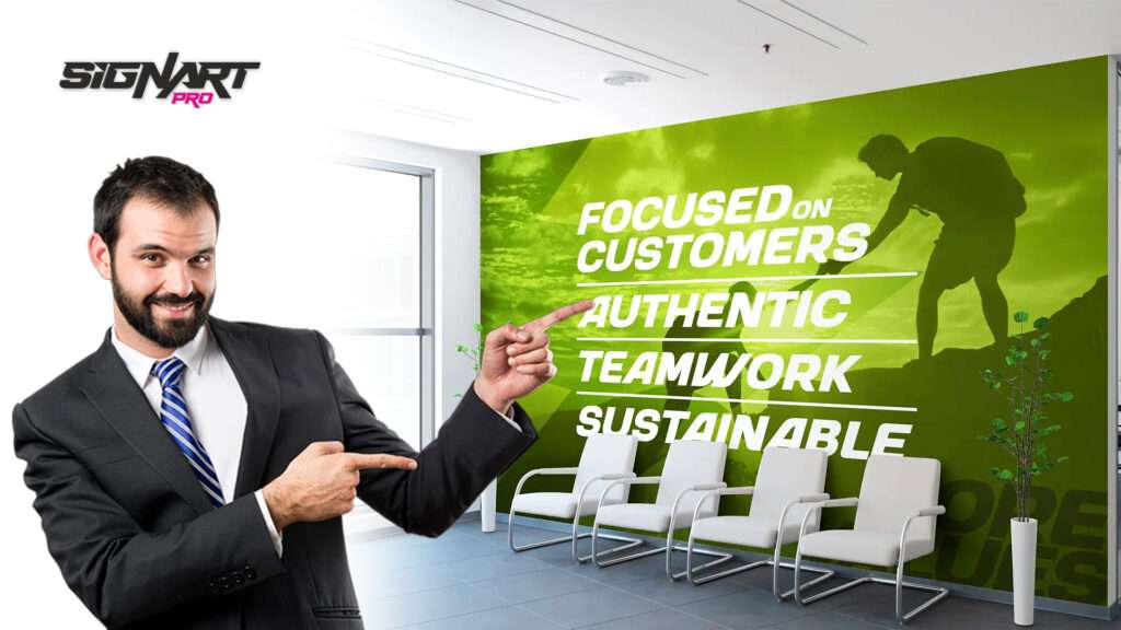
5. Branding Beyond the Logo
While your logo is important, office signage can go beyond that to reinforce culture and values.
Wall graphics with motivational quotes or milestones
Frosted glass films with patterns or mission statements
Display boards showcasing achievements or photos
These branded signage elements add personality and make your office a more engaging place.
6. Desk and Department Identification
Large offices benefit from desk nameplates or department markers, especially in open-plan layouts.
Nameplates: Help guests find the right person quickly
Department signs: Group work areas clearly for efficiency
Hot desk identifiers: Removable or digital options for flexible workspaces
Keeping a consistent style ensures cohesion across your office signage.
7. Materials and Finishes for a Professional Look
The material can make or break signage impact.
Metal: Durable, sleek, ideal for corporate branding
Acrylic: Versatile, modern, cost-effective
Wood: Warm and traditional for a welcoming feel
Illuminated signs: Increase visibility and prestige
Finishes like brushed aluminium, polished acrylic, or UV-printed designs elevate the professional look.
8. Accessibility Considerations
In the UK, the Equality Act 2010 requires workplaces to make reasonable adjustments for people with disabilities, including signage.
Use tactile text and braille where appropriate
Ensure high contrast between text and background
Position signs at an accessible height
Compliance isn’t just legal—it ensures inclusivity in your workspace.
9. Keeping Your Signage Updated
Even the best-designed signage can become outdated due to rebrands, relocations, or new safety regulations.
Best Practices:
Review signage annually
Choose modular designs that can be updated easily
Work with a signage company in Luton that offers maintenance and updates
10. Why Work with SignArt Pro for Your Office Signage
At SignArt Pro, we specialise in tailored signage for offices—from welcoming reception signs to functional conference room signs. Our process covers:
Site surveys to assess your needs
Custom designs that reflect your brand identity
Compliance with UK safety and accessibility standards
Professional installation for a flawless finish
We combine creativity with functionality, ensuring your office signage works as hard for your brand as your team does.
Conclusion
The right office signage does more than just label spaces—it enhances brand perception, improves navigation, and creates a positive experience for employees and visitors alike.
From an impressive reception sign to well-placed wayfinding and compliant safety signage, every piece should tell your brand story while serving practical needs.
By following these best practices—and partnering with an experienced signage provider like SignArt Pro—you can transform your office into a functional, stylish, and compliant environment that leaves a lasting impression.